
Source:

Source:

First Draft. Did not like the text at all...

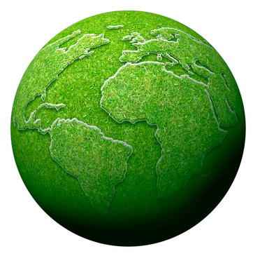
Final: Decided on black and white for the background to really bring out the green on the "green earth" picture. Also feel that it helped accent the text at the top allowing it to draw your attention back to the bottom text. Thoughts ???
Revised version of final split in two with larger text:


Revised version of final split in two with larger text:

or....

I like the black and white offset by the green. Its to hard to read the bottom headline in the final. Why not split both headlines in two and make them much bigger. If you do I will give you a 95.
ReplyDeleteJon
Thanks Jon for the input. Is this more or less what you were thinking ??
ReplyDeleteThanks,
Steve